Candle heatmap
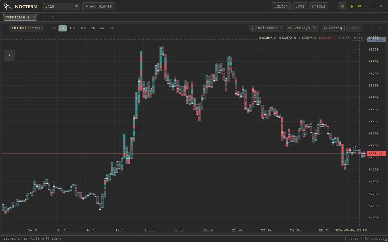
The candle heatmap replaces plain candles with candles painted by order flow. Each bar is a stack of heat cells - green where buyers were the aggressor, red where sellers were - and the brighter the cell, the more size traded there. It shows something a normal candle hides: where inside the bar did the volume actually print?
Overview
Section titled “Overview”Where footprint gives you the numbers, the candle heatmap gives you the picture - the same buy/sell-by-price information rendered as colour so you can read a whole screen of bars quickly. A bright green band low in a bar is buyers stepping in at the lows; a bright red cap is sellers hitting the highs.
How to use
Section titled “How to use”-
Open Chart Options and switch on the Candle Heatmap.
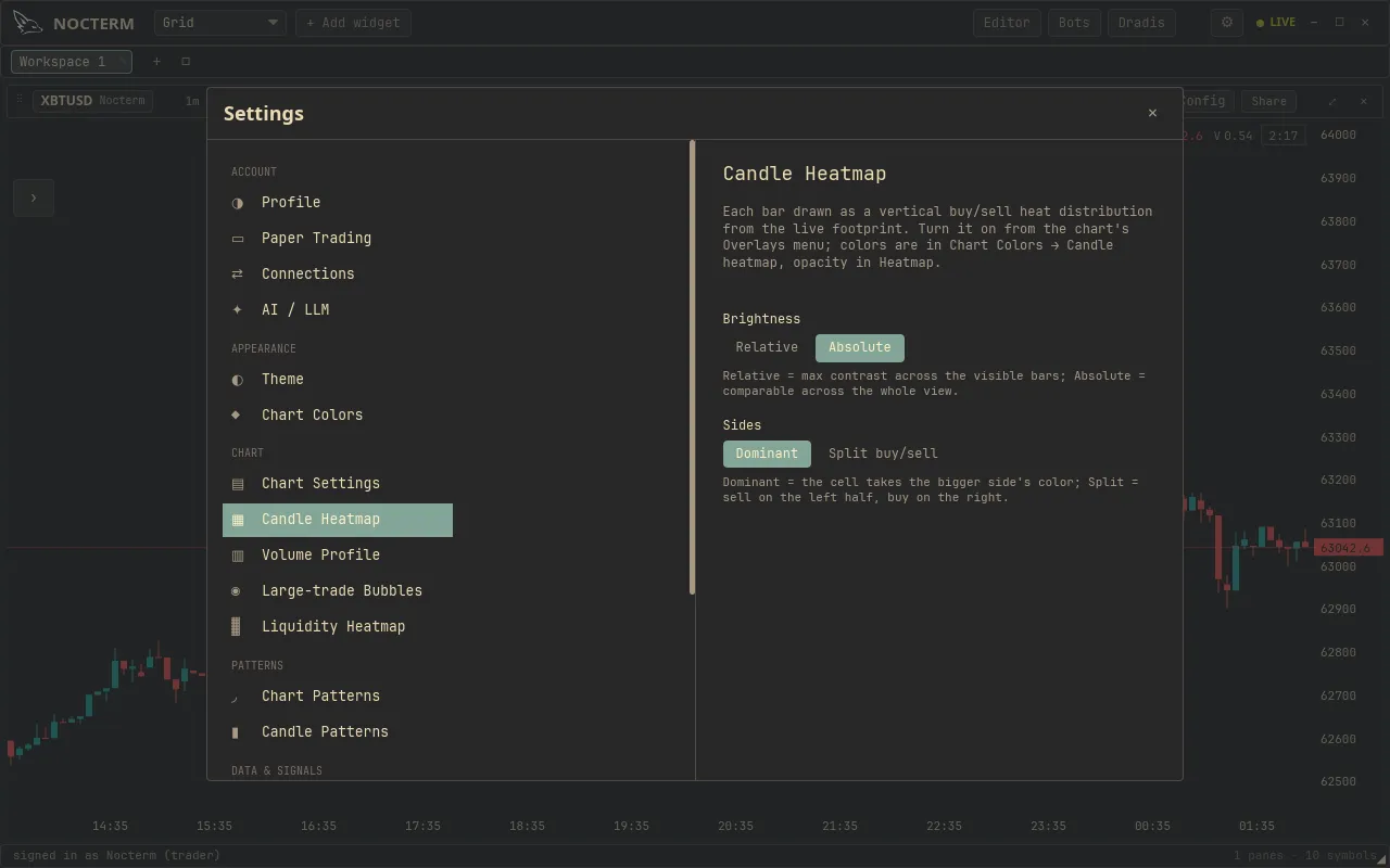
Candle Heatmap settings - source, scale, sides, colors, line width -
Choose a source and scale for what brightness means, then read the bars: the hottest cells are where the most aggressive volume traded.
Settings
Section titled “Settings”| Option | Values | What it does |
|---|---|---|
| Source | Volume / Large trades | Heat from total volume, or only the largest prints |
| Scale | Relative / Absolute | Normalize within each candle, or compare size across all bars |
| Sides | Dominant / Split | One colour per cell (winning side), or buy and sell shown side by side |
| Colors | Custom | Recolour the buy and sell heat |
| Line width | - | Thickness of the heat bands |
Related
Section titled “Related”- Footprint - the same data as per-price numbers.
- Trade bubbles - surface only the largest individual prints.
- Chart colors & themes - recolour the heat to taste.