Liquidity Heatmap
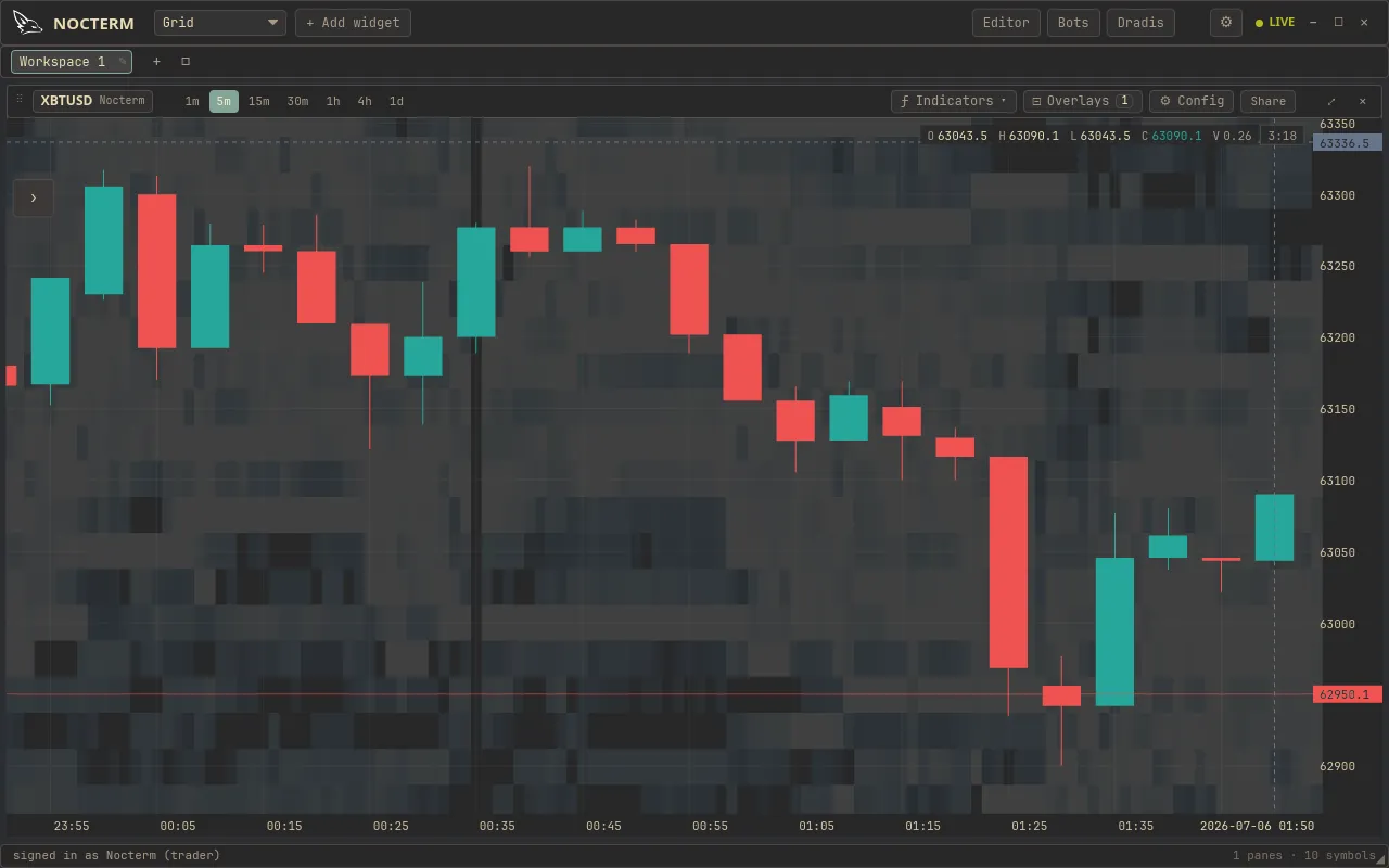
The liquidity heatmap paints the resting order book directly onto the chart: brighter cells mean more size resting at that price. It shows where the walls are - the support and resistance that real orders, not lines, are defending.
Overview
Section titled “Overview”Every price level is shaded by how much size is resting there right now. As orders are posted and pulled, the heat shifts - so a thick band that holds is a defended level, and one that evaporates as price approaches is liquidity being pulled ahead of a move.
How to use
Section titled “How to use”-
Open Chart Options and switch on Heatmap.
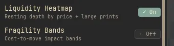
The Chart Options panel with the Heatmap section expanded and the toggle on -
Tune the look so the walls stand out without drowning the candles - set a color theme, opacity, and a minimum-volume filter to hide noise.
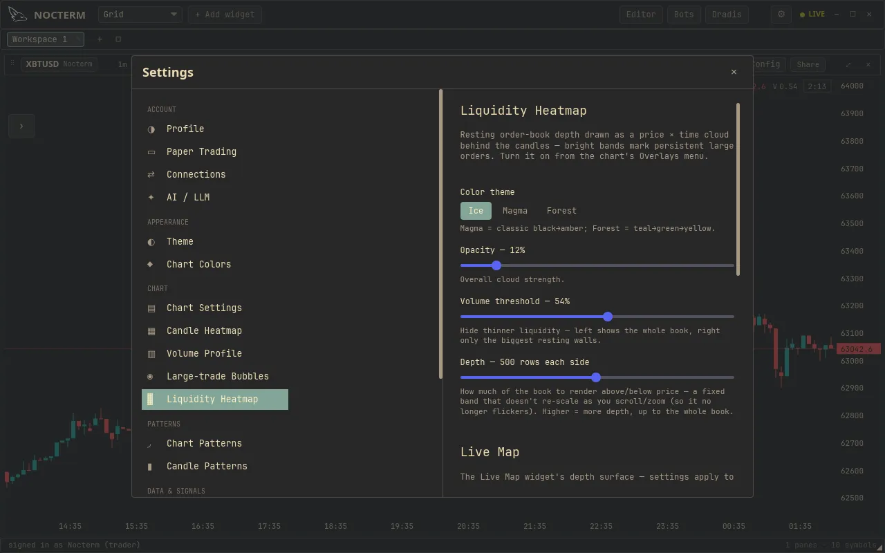
The Heatmap settings: theme, opacity, and min-volume filter
Settings
Section titled “Settings”| Option | Values | What it does |
|---|---|---|
| Theme | Hot / Cold / Tint / Custom | Color ramp used for intensity |
| Opacity | 0.25–2× | Overall strength of the overlay |
| Min volume | 0–85% | Hides levels below this share of the largest, cutting noise |
Related
Section titled “Related”- Pull / Post bands - liquidity being added vs cancelled.
- Fragility bands - the notional it takes to move price.